
Zhiyan Rao
Zhiyan Rao is a graphic designer whose practice explores the relationship between typography, language and social structures. Through research-led design, she investigates how graphic design can make invisible cultural assumptions visible through visual form. Working primarily with experimental typography and screen printing, she develops projects that translate social and linguistic research into critical visual communication. Her practice is driven by a belief that typography is not simply a medium for conveying information, but an active visual system capable of shaping meaning, influencing perception and opening new perspectives on contemporary social discourse.
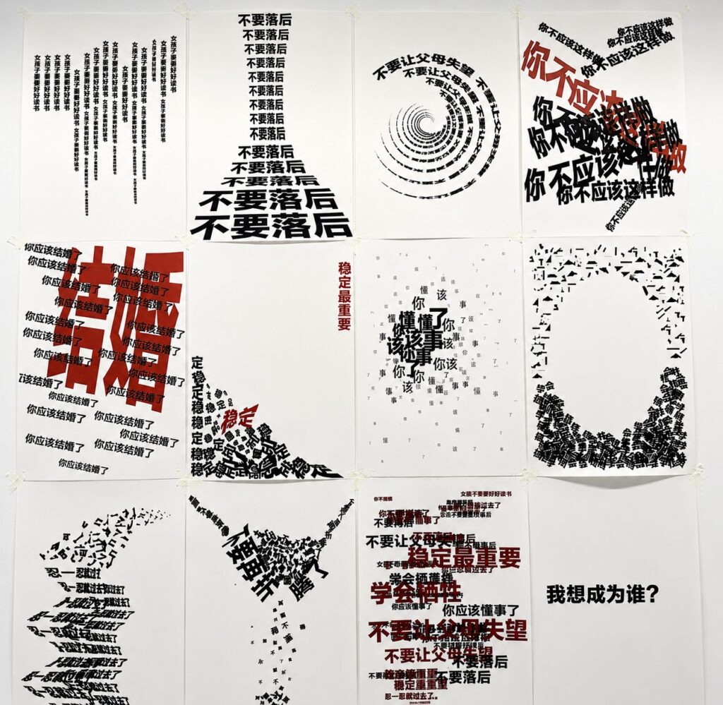
Disciplinary Language
Disciplinary Language explores how experimental typography can expose and critique forms of disciplinary language experienced by Chinese women. The project developed from interviews in which recurring phrases of advice, expectation and correction revealed how seemingly ordinary language can carry social pressure and cultural assumptions.
Rather than illustrating these phrases literally, the project translates their linguistic behaviours into typographic form. Repetition, overlay, fragmentation and distortion are used to examine how disciplinary language can accumulate, intrude, become internalised and eventually be resisted. These methods developed through iterative visual testing in which density, scale, direction, legibility and spatial relationships were treated as ways of changing how the language is encountered.
The final outcome is a series of twelve A2 screen-printed posters. Screen printing gives the language a physical presence through ink, repetition and material weight, reinforcing the relationship between typographic form and social pressure. Together, the posters move from the gradual appearance of disciplinary language towards accumulation, disruption and resistance.
A final series of twelve screen-printed A2 posters investigating how experimental typography can visualise, expose and critique the disciplinary language experienced by Chinese women. Developed through interview-based research, the project translates recurring social expectations into typographic form using repetition, overlay, fragmentation and distortion.
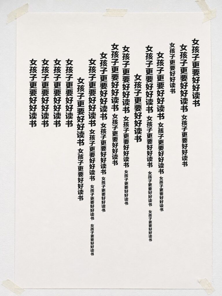
The repeated phrase "Girls should study harder" marks the beginning of the series. Repetition is used to visualise how disciplinary language first enters everyday life—not as a single command, but as a voice that returns persistently until it becomes normalised.
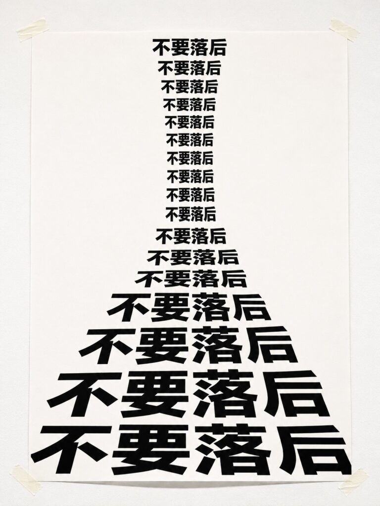
This poster uses repetition to visualise how disciplinary language accumulates over time. The phrase "Don't fall behind" grows progressively larger and heavier, transforming an ordinary reminder into an increasingly dominant social expectation. The composition reflects how repeated comparison and pressure become normalised through continual exposure.
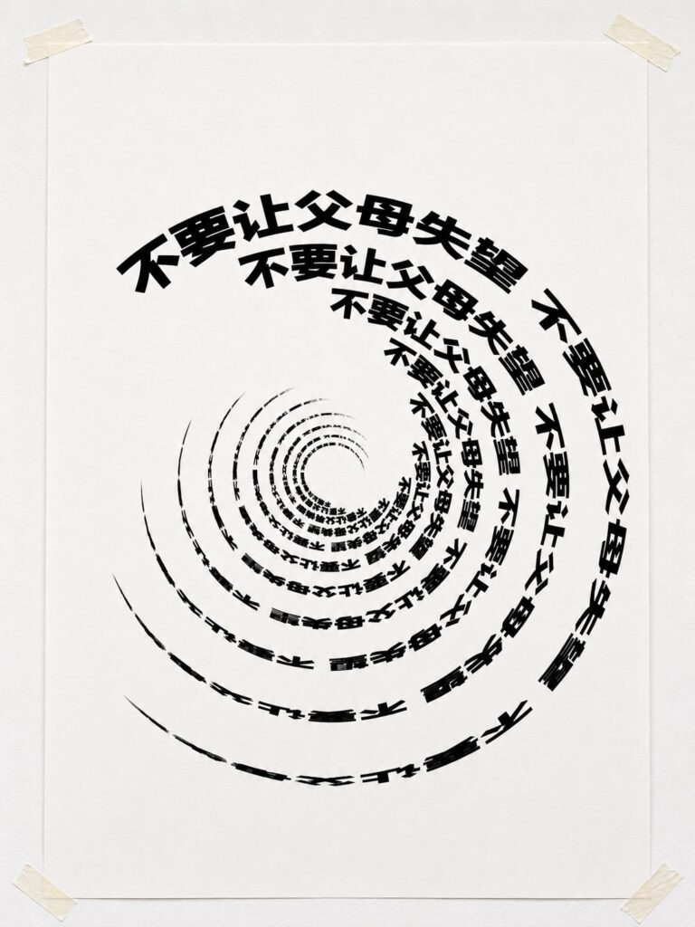
This poster explores how repeated disciplinary language becomes psychologically internalised. The spiral composition draws the repeated phrase towards a central point, suggesting how external expectations can become increasingly difficult to escape. Repetition is used not only to communicate frequency but also to visualise the gradual concentration of social pressure within the individual.
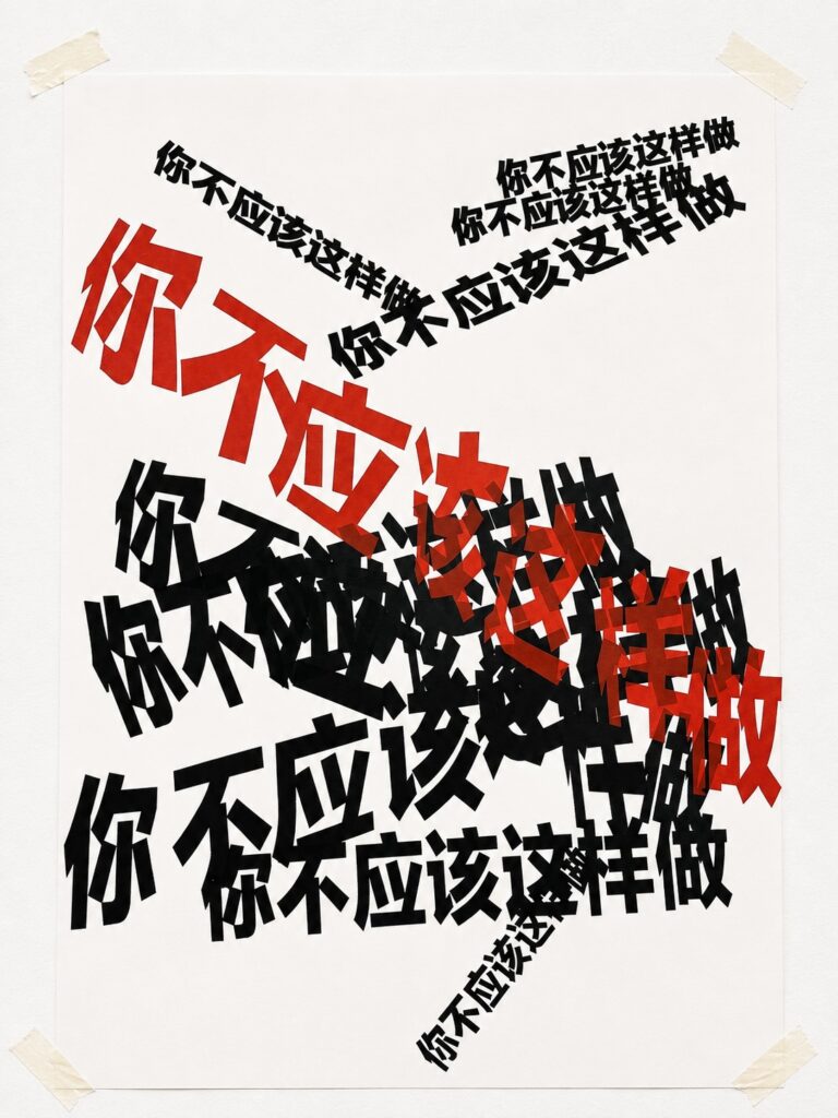
This poster marks the transition from repetition to intrusion. Through overlapping layers of black and red typography, the phrase "You shouldn't do that" becomes increasingly difficult to separate or ignore. Overlay is used to visualise how disciplinary language interrupts personal judgement, occupying both visual and psychological space.
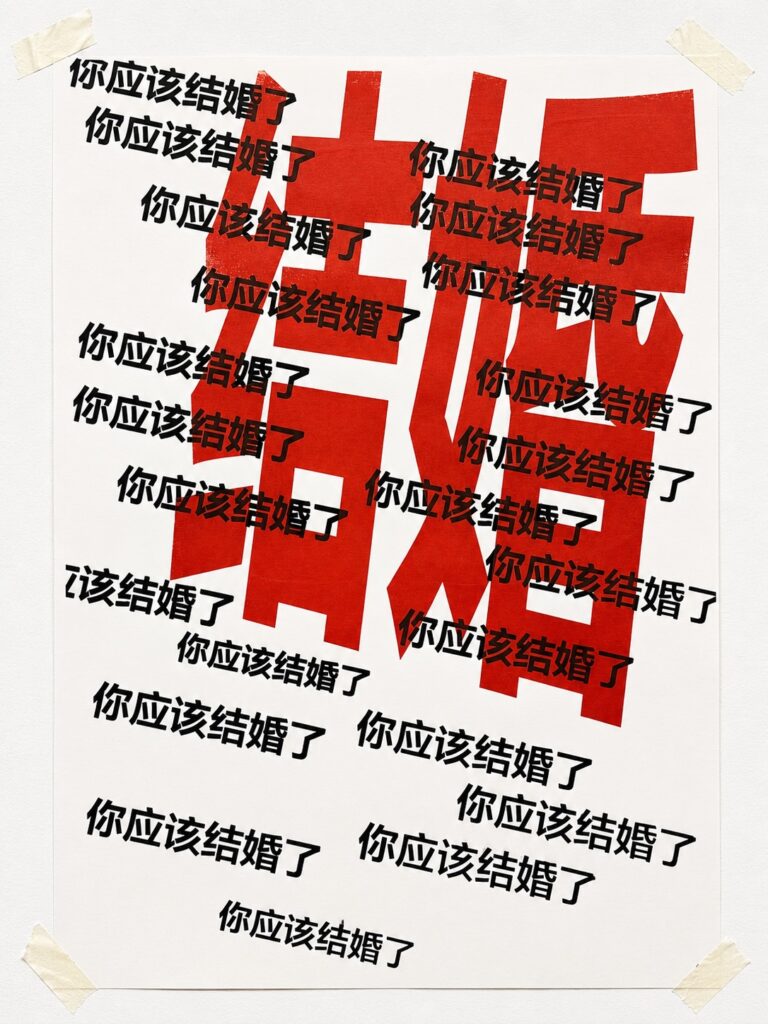
This poster explores how repeated expectations surrounding marriage can dominate personal choice. Layers of black and red typography overlap and compete for attention, visualising how a single social expectation repeatedly overrides individual agency. Overlay is used to express the persistence and authority of disciplinary language.
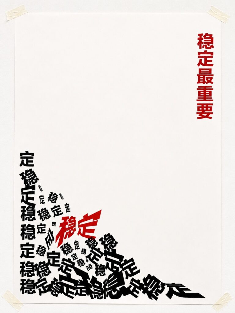
This poster explores how the repeated demand for stability gradually dominates individual decision-making. Overlapping typography accumulates into an increasingly dense composition, visualising how a single expectation can become difficult to separate from personal judgement. Overlay is used to express the persistence and authority of disciplinary language.
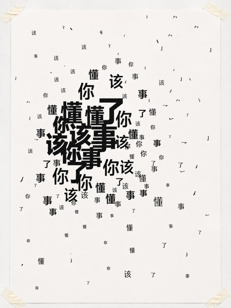
This poster marks the transition from external pressure to internalisation. The phrase gradually disintegrates into scattered characters, suggesting how repeated disciplinary language becomes absorbed into one's own internal voice. Fragmentation is used to visualise the gradual loss of clarity between external expectations and personal identity.
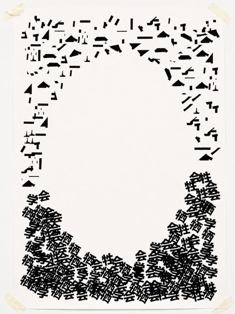
This poster explores the disappearance of the self after disciplinary language has been internalised. Fragmented typography gathers around an empty centre, suggesting that repeated expectations leave little space for individual identity. Fragmentation is used to visualise absence rather than destruction, allowing the missing centre to become the focus of the composition.
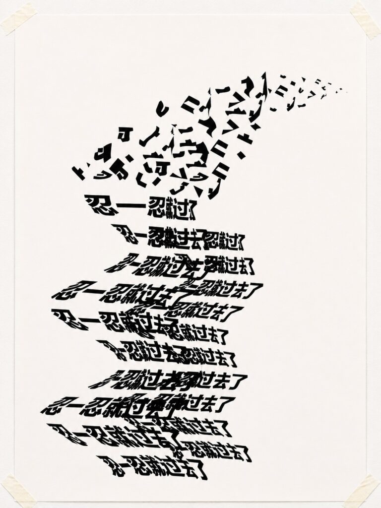
This poster examines how disciplinary language encourages endurance instead of resistance. Distorted typography moves diagonally across the composition, suggesting that repeated expectations gradually redirect personal agency. The work visualises compliance as a continuous process rather than a single decision.
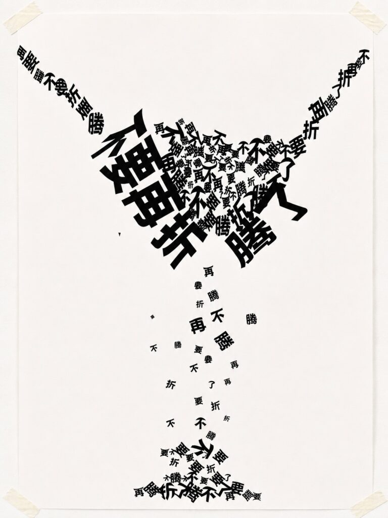
This poster examines how disciplinary language suppresses attempts to challenge social expectations. Fragmented typography appears to split apart and disintegrate, visualising the tension between resistance and the pressure to conform.
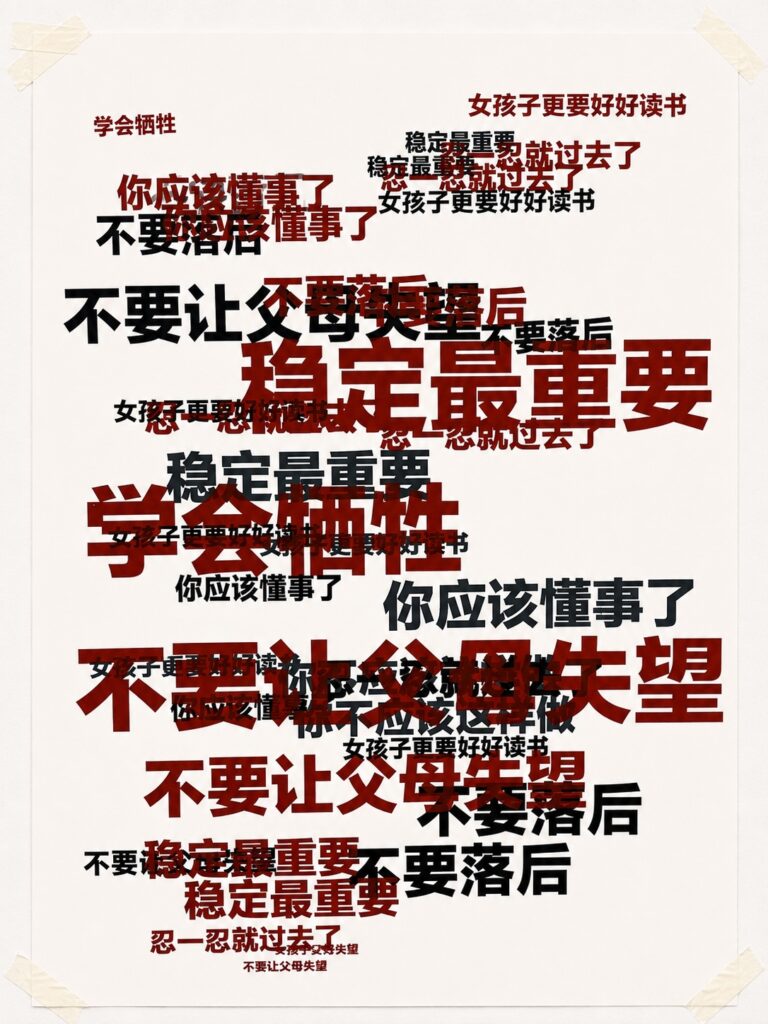
This composite poster brings together all twelve disciplinary phrases into a single typographic field. Individual voices merge into a collective visual structure, revealing how repeated expectations accumulate into a persistent system of social pressure.
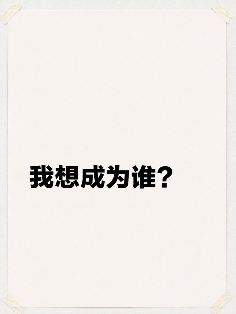
The final work shifts from disciplinary statements to an open question. Surrounded by empty space, the typography invites reflection on personal agency beyond externally imposed expectations.