

Jia Shen
My practice investigates how graphic design participates in the organisation of social behaviour, particularly within public and institutional systems. I am interested in the point at which design moves beyond communication and begins to structure how individuals are identified, positioned and expected to act.
My final project, PLEASE WAIT: Graphic Design, Invisible Authority and the Aesthetics of Obedience, examines the visual language of administration through queue numbers, tickets, signs, routes and polite instructions. These ordinary graphic forms appear neutral, yet they contribute to systems that classify people, regulate movement and define acceptable behaviour.
Rather than treating authority as something only imposed through visible force, the project considers how power can be distributed through typography, hierarchy, repetition, spatial direction and institutional language. Across a series of posters and material experiments, the work asks how graphic design can make control appear efficient, reasonable and even desirable.
My broader practice is concerned with the social and political consequences of visual systems: how design produces legibility, how institutions translate people into data, and how everyday forms of obedience are normalised through seemingly objective graphic structures.
PLEASE WAIT
PLEASE WAIT investigates how graphic design participates in the organisation of social behaviour through ordinary systems of information, instruction and visual order.
In hospitals, banks, airports, restaurants and government offices, people encounter queue numbers, tickets, signs, arrows and polite instructions. These graphic forms appear neutral and functional, yet they classify individuals, assign positions and direct behaviour.
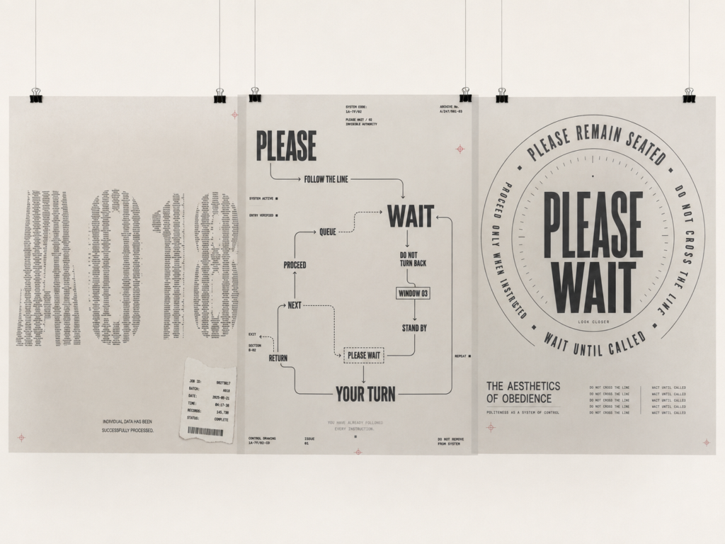
The project examines this process through three operations: classification, direction and normalisation. From People to Numbers transforms individual names into the administrative identity A018. Invisible Authority uses routes and repeated commands to direct the viewer’s reading path. The Aesthetics of Obedience organises restrictive language into a calm and visually ordered system.
Through posters, tracing-paper layers and printed publications, the project asks how graphic design can make institutional authority appear efficient, reasonable and aesthetically acceptable.
Final poster series exploring how graphic design participates in systems of classification, direction and normalisation within everyday institutional life.
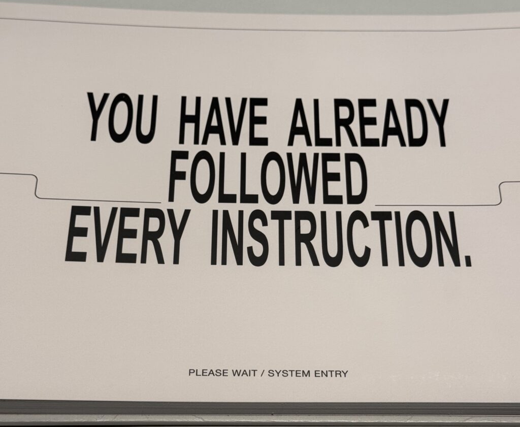
From this point, viewing becomes participation. The reader enters the project’s system of instructions before becoming fully aware that they are following it.
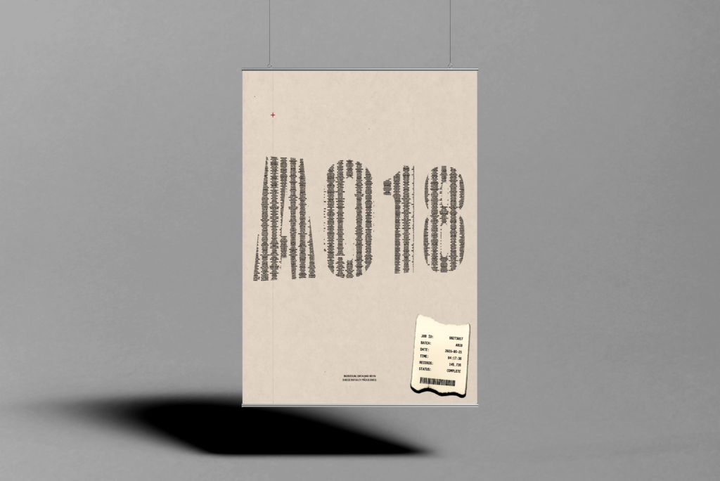
Poster examining how individual identity is absorbed into administrative classification through the code A018.
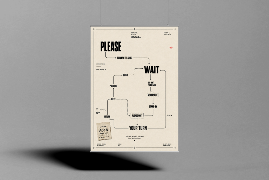
Poster exploring how graphic sequence, routes and repeated commands direct attention and movement.
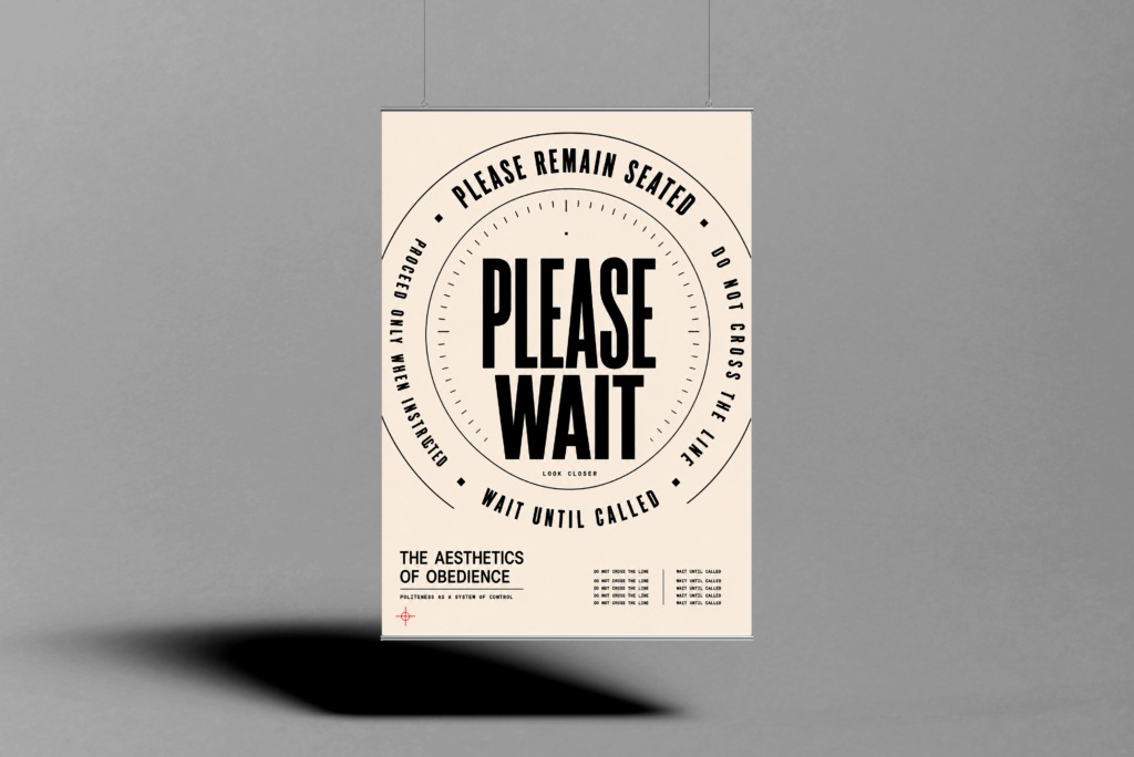
Poster examining how restrictive instructions can be normalised through clarity, order and visual elegance.
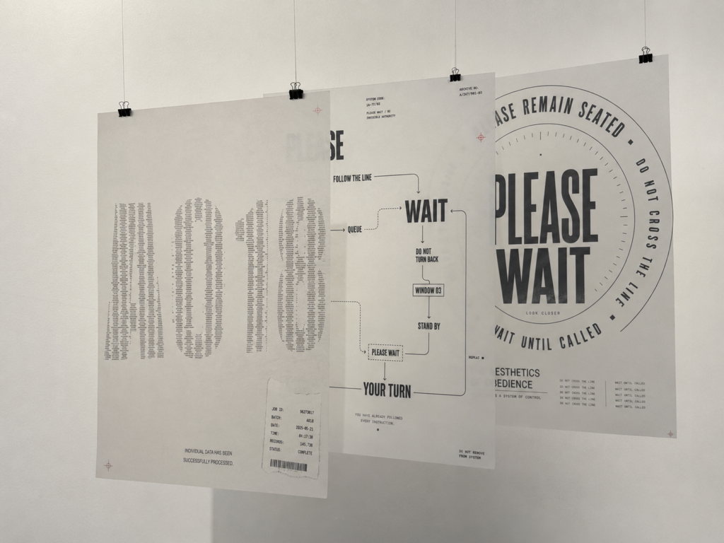
Three tracing-paper posters layered as one visual system, allowing classification, direction and normalisation to overlap physically through transparency.
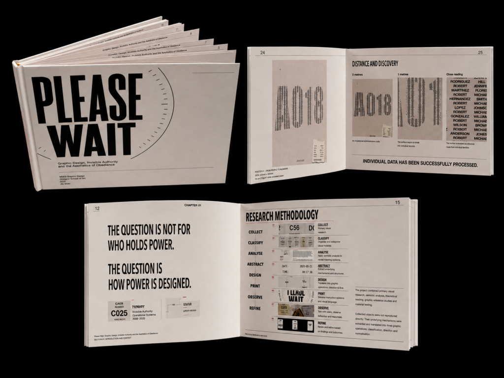
Interior spreads documenting the project’s research, visual methodology and development process.
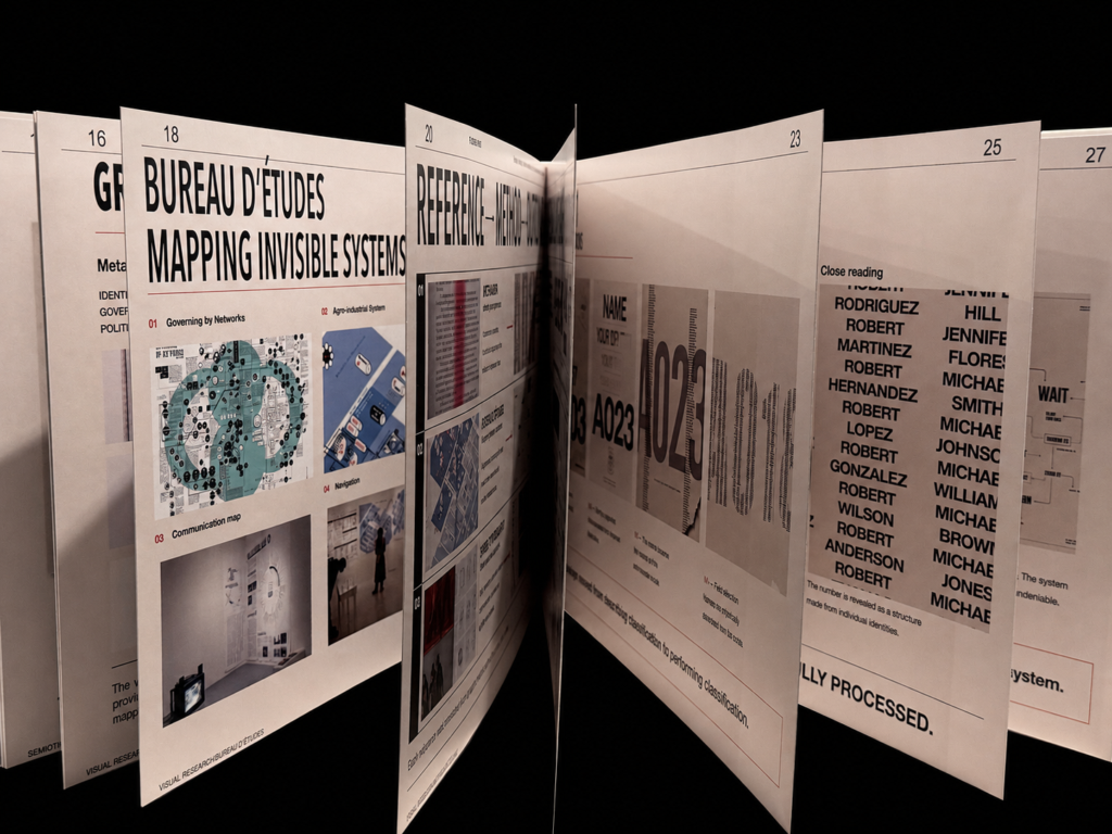
Publication spreads showing how research into mapping, institutional systems and graphic authority informed the visual development of PLEASE WAIT.
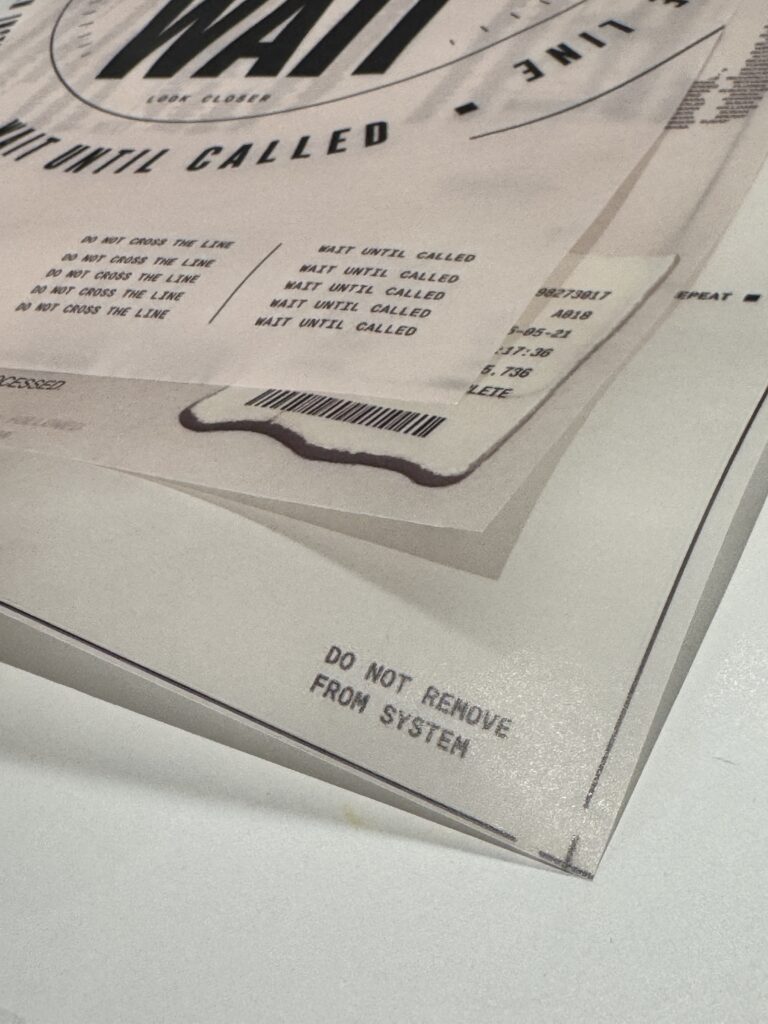
Close-up of the translucent poster layers, showing how separate systems of classification, direction and instruction remain partially visible through one another.
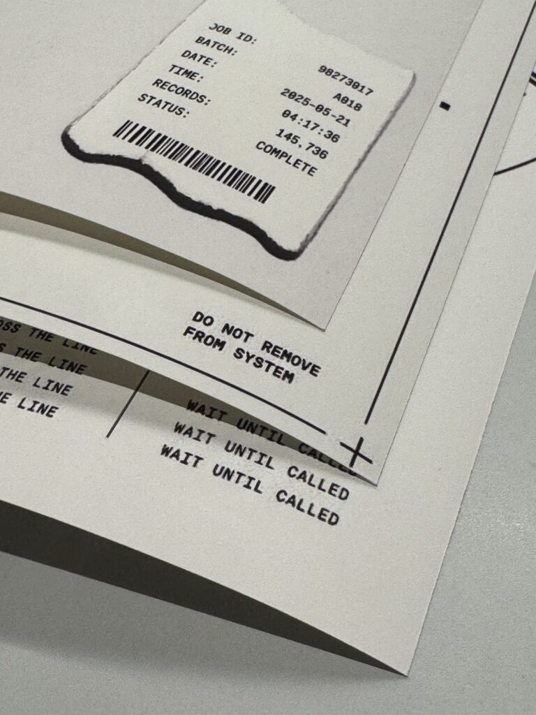
Detail of three printed posters physically layered together, exploring how separate graphic systems accumulate through material and repetition.