RABBIT HOUSE
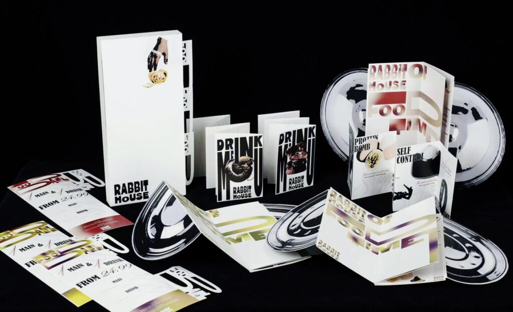
The “Rabbit House” project stems from my ongoing observation of the lived experiences of people with eating disorders (ED). Early on, I took a few wrong turns; I initially tried to depict body-image anxiety by focusing on specific facial features or body parts. However, inspired by the ethical shift from mere “attention” to genuine “care”—a concept articulated by María Puig de la Bellacasa—I decided to strip away all decorative visual artifice and pivot toward a purely rational, text-based typographic approach.
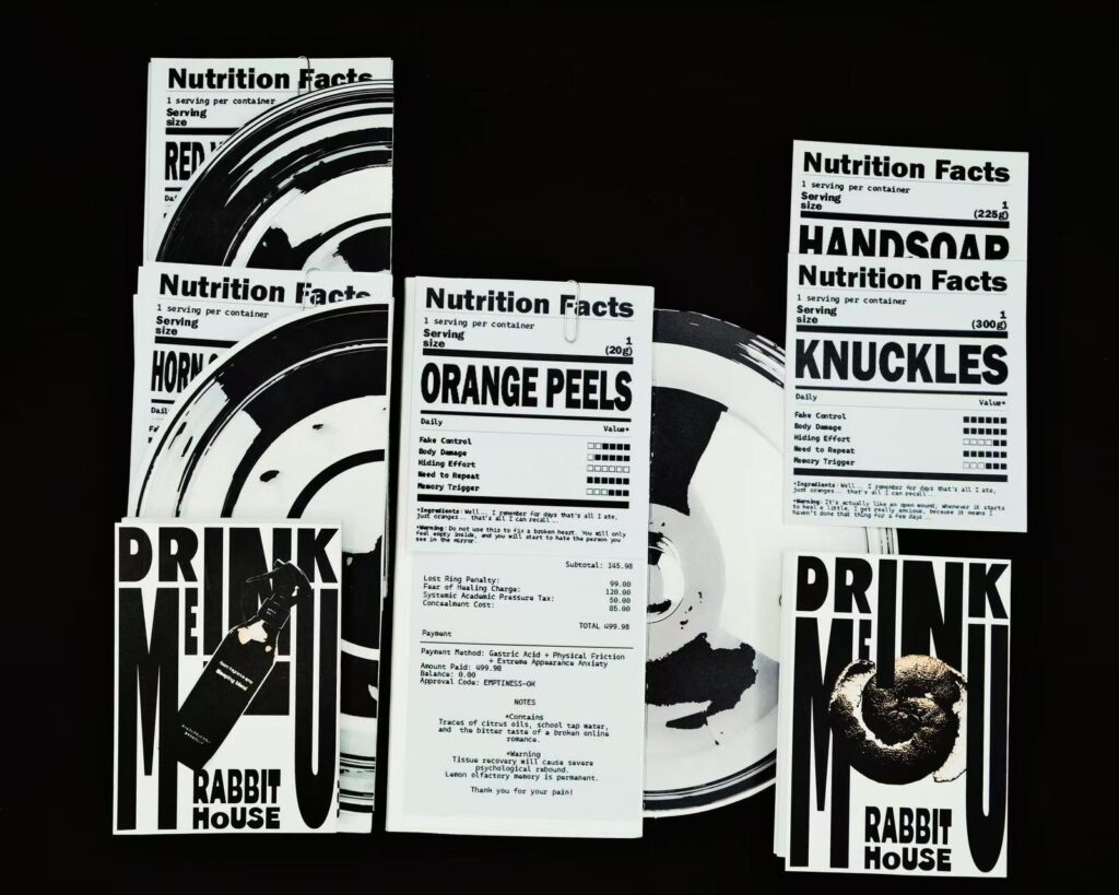
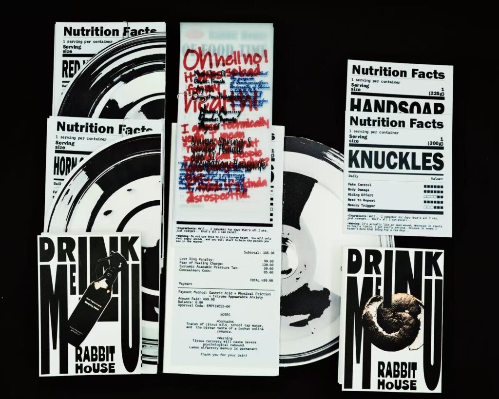
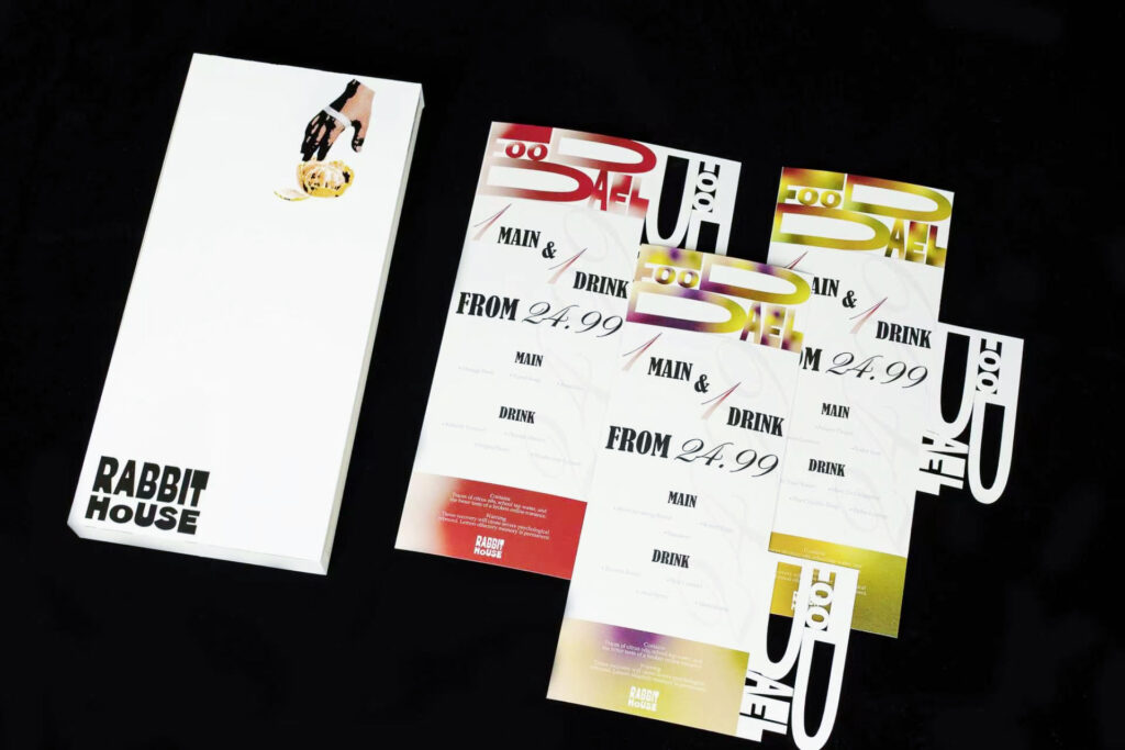
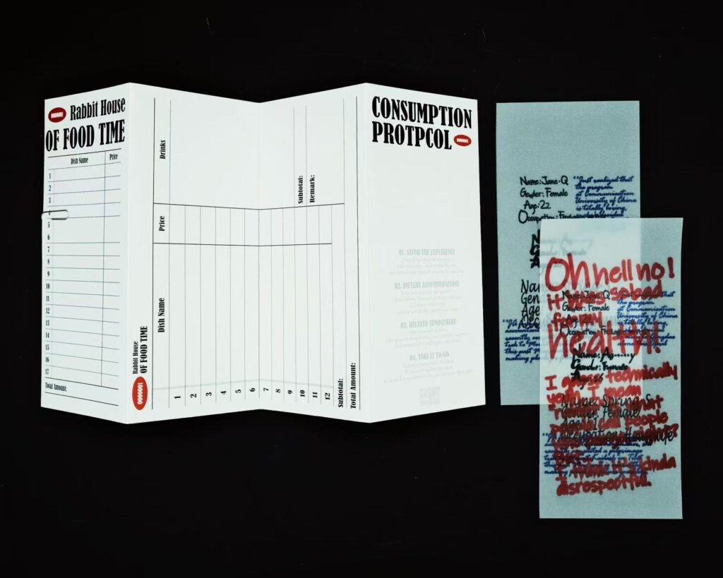
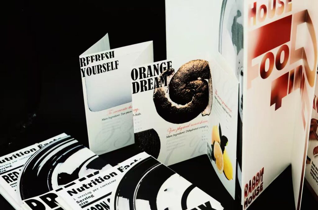
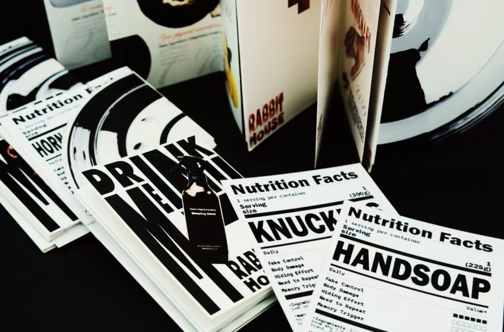
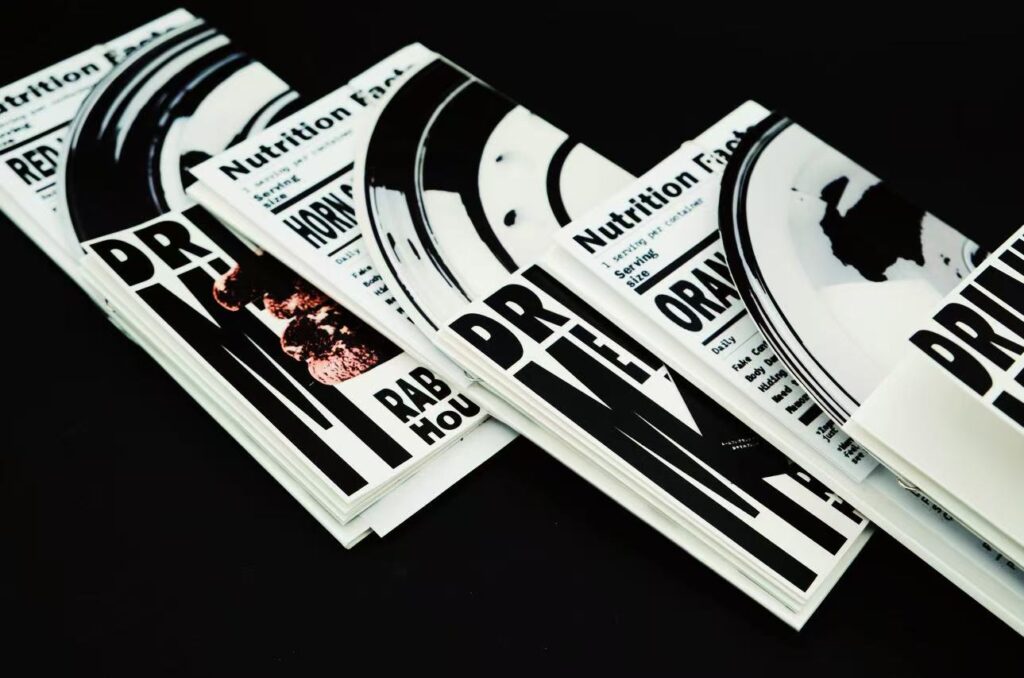
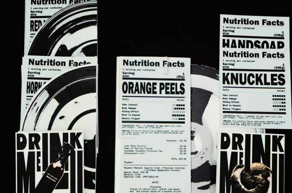
Since the cold, systematic rules of such systems carry an inherent sense of oppression, how could I visually push back? I found inspiration after observing how Metahaven subverts corporate visual language. I invented a fictional restaurant chain called “Rabbit House” and attempted to stage a “typographic hijacking” by appropriating the mundane scenarios of ordering food and settling the bill. When gathering core data, I eschewed grand medical terminology in favor of Giorgia Lupi’s micro-perspective, extracting specific, personal artifacts from the genuine trauma of interviewees (such as my close high school friend, Jane Q): lemon-scented hand soap reeking of stomach acid; knuckles scarred by teeth marks and scabs; and the desperate recitation of the Lord’s Prayer while kneeling before a toilet bowl. I forcibly embedded these tiny objects—each bearing the weight of searing memories—into the rigid structures of FDA nutrition labels and thermal-paper receipts.
I intended this to be a deliberate subversion of established typographic order. When the most intimate, agonizing physical traumas collide with such cold, unfeeling commercial typography, the design ceases to be a mere narrator of a tragic tale; instead, it reenacts the very behemoth of a system that drives people to madness. This ironic visual confrontation aims to lay bare the absurdity of attempting to quantify human suffering through cold, clinical data.