
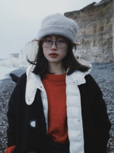
Can Hou
Can Hou is a graphic designer specialising in brand identity, packaging, editorial and information design. Coming from a non-traditional art background, Hou takes a practice-led approach that combines visual experimentation with critical thinking. Her work is often influenced by community and culture, with a particular interest in how graphic design shapes the way people read, understand and respond to everyday information.
Her final MDes project, LuckinPost, examines how factual information on packaging can be selected, organised and visually presented to construct brand narratives. Taking Luckin Coffee as a case study, Hou experimented with colour, typography, layout and logo design, and developed the project into six issues of a fictional brand publication. Through humorous news stories, the publication reframes real but easily overlooked packaging information and encourages audiences to reconsider how design influences their understanding of products.
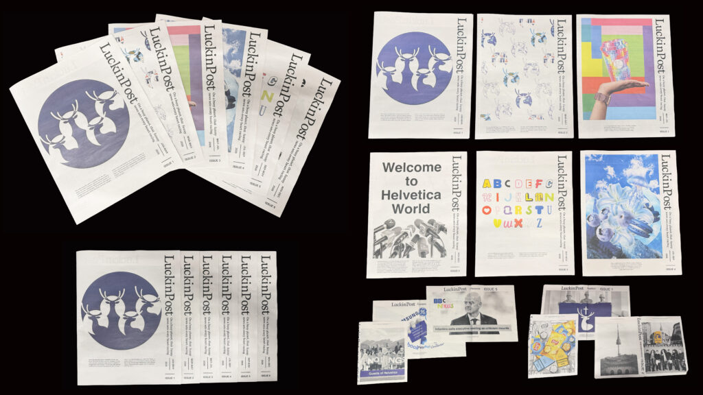
LuckinPost
LuckinPost is a free fictional brand publication series for consumers, based on Luckin Coffee’s brand philosophy and packaging design. It transforms packaging information that is easily overlooked and discarded into humorous news stories, and ultimately uses the brand identity to guide consumers to re-examine packaging information and recognise that this information is not presented neutrally, but is selected and designed to influence consumers’ perceptions and purchasing behaviour.
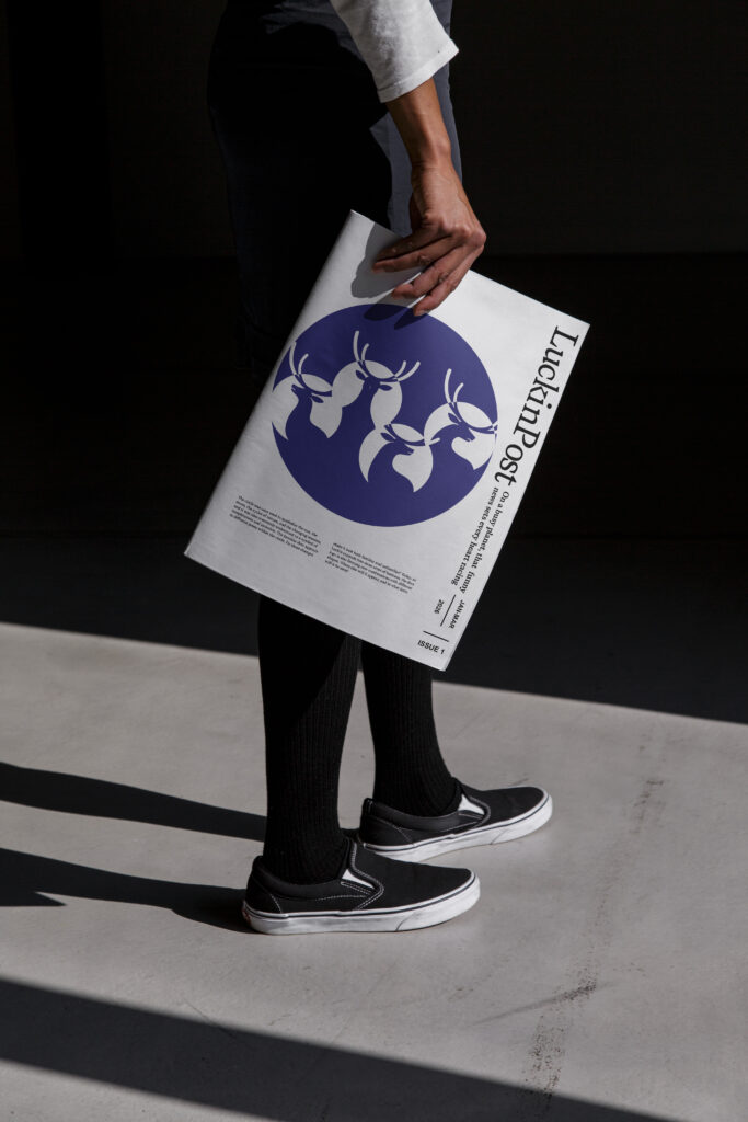
LuckinPost is designed as a physical newspaper that can be carried, unfolded and read in everyday environments, allowing the publication to exist beyond the gallery or screen.
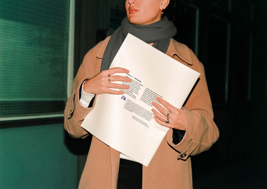
The large-format newspaper creates a direct relationship between the reader and the printed object, while its familiar format makes the fictional brand stories feel believable and accessible.
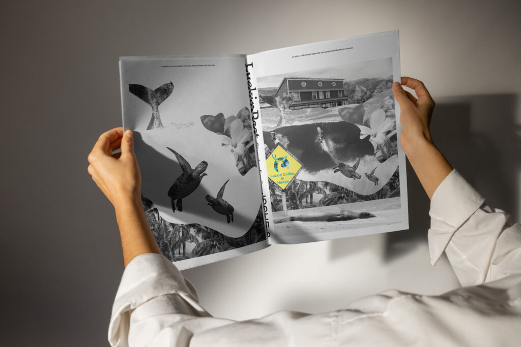
Each issue combines photomontage, typography and newspaper-style layouts to transform existing packaging information into fictional news narratives.
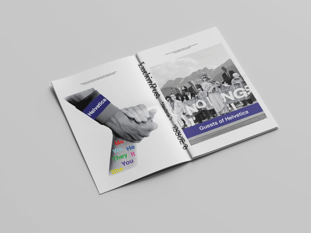
The newspaper format encourages readers to physically move through different layers of information, allowing meaning to develop through sequence, scale and visual hierarchy.
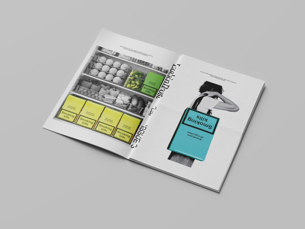
Colour is treated as more than decoration. By placing familiar colour systems in unexpected contexts, the project explores how colour can influence association, recognition and interpretation.